We are constantly celebrating the holistic nature of brand. Brand goes way beyond logo, we tell almost anyone who will listen. “Way beyond the idea of identity, in general. A brand is a promise that must be seen, heard, and felt by everyone an organization touches.”
What we say may be true, but there is no getting around the fact that the visual logo is the most potent of all lightning rods faced by any organization undertaking a branding initiative. Why, just get close to the topic and…zap!
The confusion between brand and logo is actually quite understandable, and results from the mixing up of cause and effect. Great symbols have power because they are imbued with meaning. When we know the context that these symbols are meant to represent, we associate our understanding with the symbol itself. Simply put, the symbol becomes a shorthand for everything else the brand represents just as an apple can evolve to represent innovation and creativity, a swoosh can symbolize determination and resilience, and a pair of golden arches can be synonymous with happiness and childhood. And when symbols take on the collective associations of many…associations built by the recognition of great actions and strong reputations for following through on institutional promises…then they can become iconic.
A bold and beautifully conceived symbol can certainly help move an organization in the right direction, but it can’t carry the weight of the institutional world on its graphic shoulders. Its cues really only need to point the way. For example, if an organization wants to be seen as current, innovative, and approachable, having a symbol that feels stuffy, claustrophobic, and dated probably won’t help them move off the block and onto the road they want to travel.
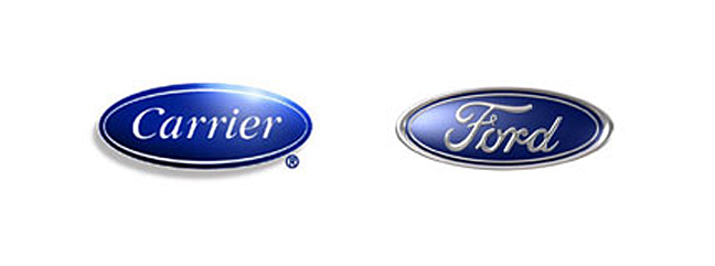
In the loud, information-soaked world in which we live, it is also increasingly tough to “own” a symbol. The economy may be shrinking but the gross output of logos worldwide continues to grow exponentially. This immense proliferation of symbols and logos highlights an even greater need for organizations to own meaning rather than just symbol. Despite their different industries, Carrier and Ford have eerily similar logos – a script typeface enclosed in a dark blue oval. Yet, because of the different meanings and associations cued by that visual, no one mistakes Ford Motors and Carrier for the same brand.
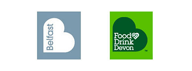
Have a look at some of these symbols. You’ll see very similar marks chosen to represent completely different entities. The similarities may illustrate one of the great tragi-comedies of our icon driven age…without the underlying institutional meaning, how could we ever know what these symbols represent?

A city in Ireland, or a town in England?

Air conditioners or autos?

Computers or outdoor clothing?

